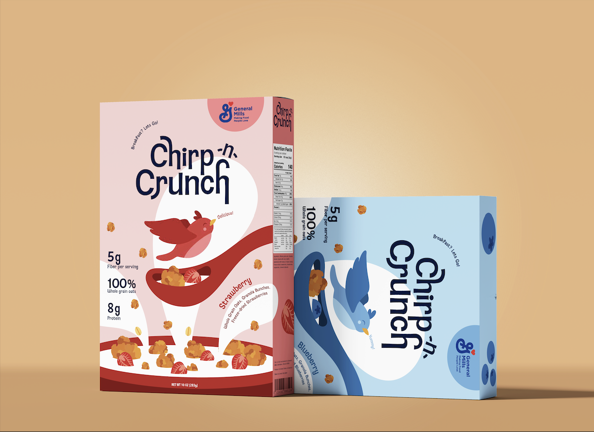
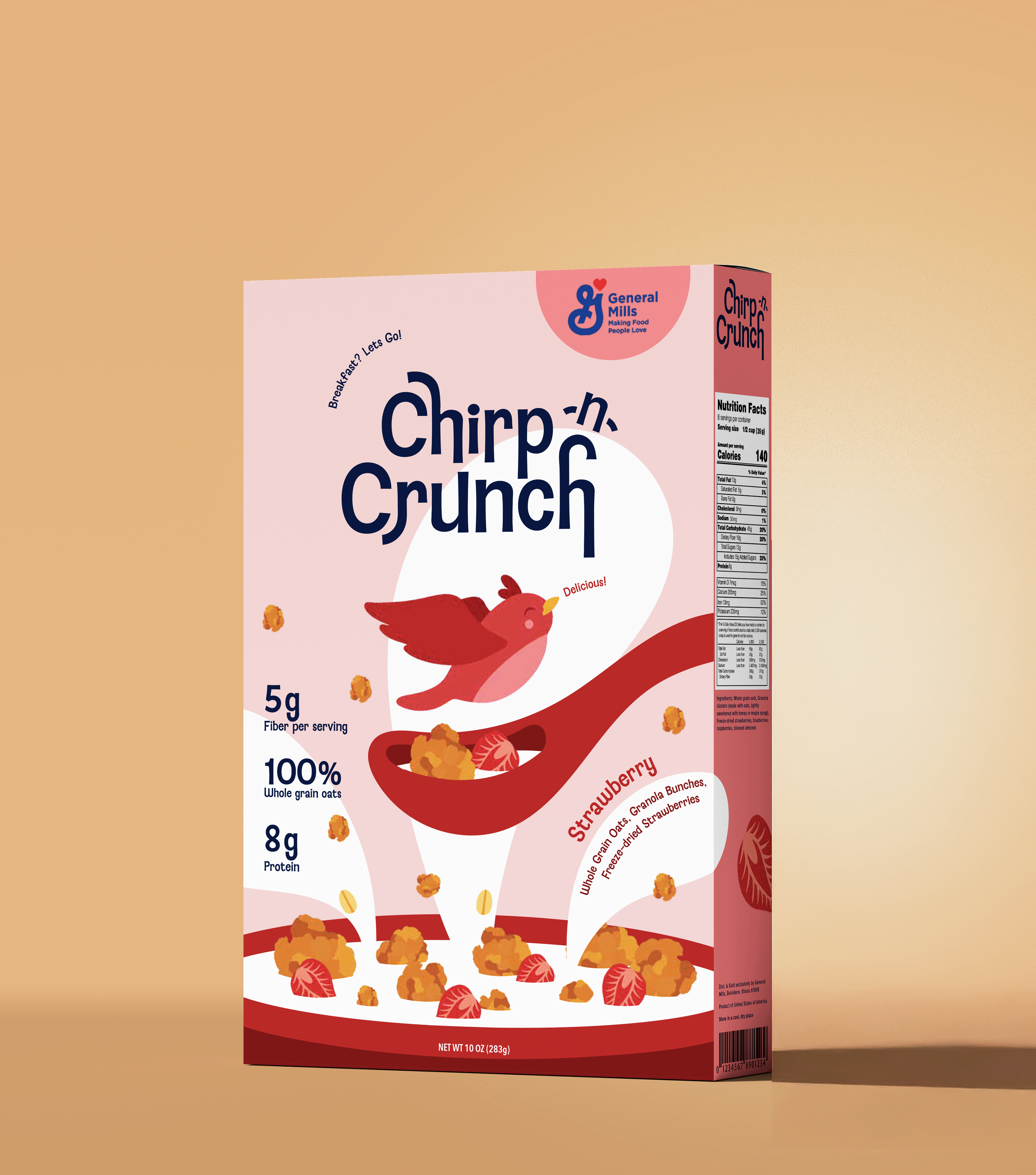
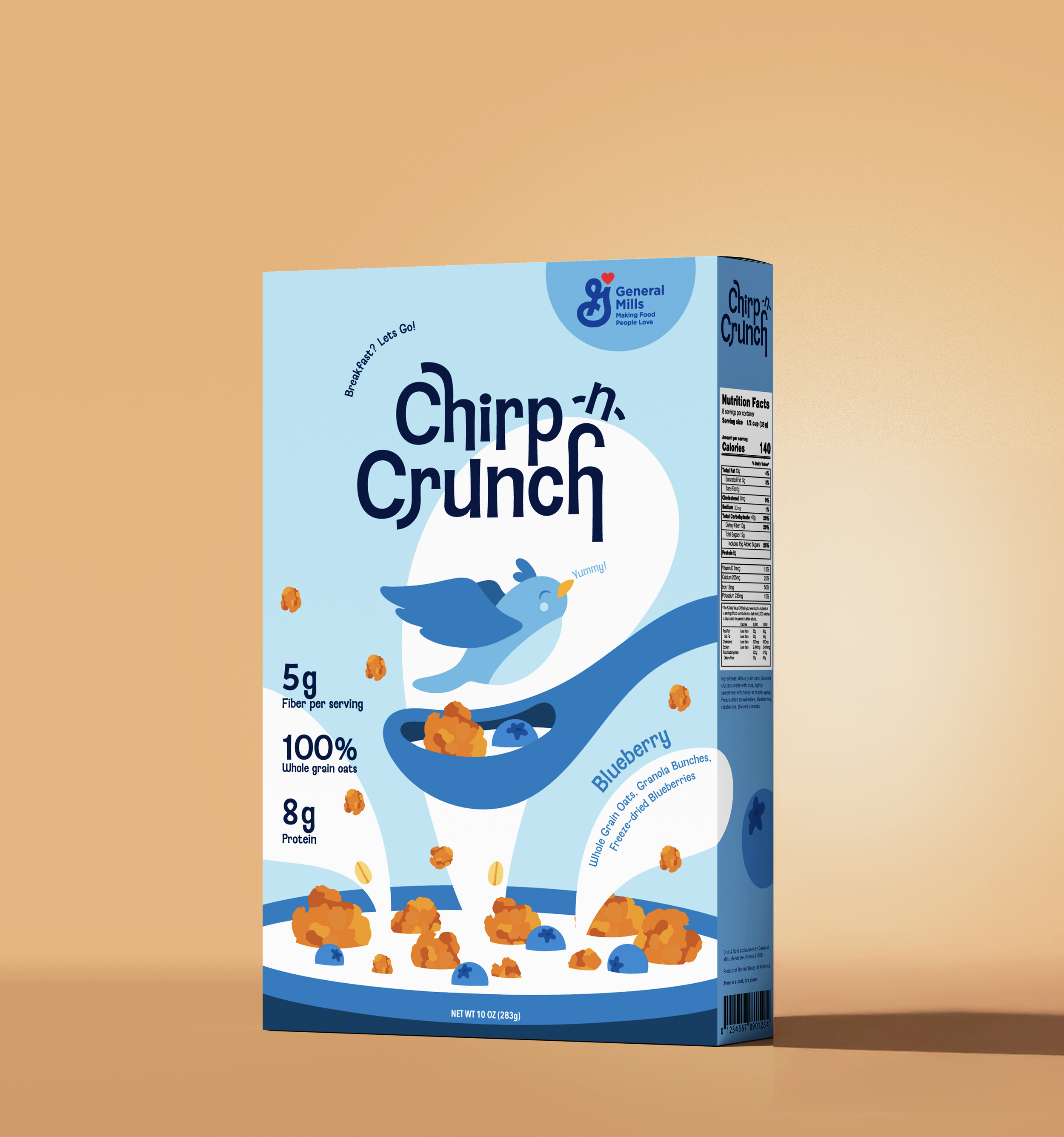
Chirp-n-Crunch is a cereal concept I created to address a common problem: many healthy cereals look dull or too serious on the shelf, making them less appealing to younger or more casual consumers. I set out to design packaging that felt fresh, organic, and fun. Something that instantly catches the eye and invites a positive start to the day.
The result is a playful, nature-inspired visual identity in two fruity flavors: strawberry and blueberry. Every element of the design from color palette to typography was carefully chosen to balance health-conscious messaging with youthful energy, creating a product that’s both nourishing and joyful.
Chirp-n-Crunch Cereal
02
Campaign Concept
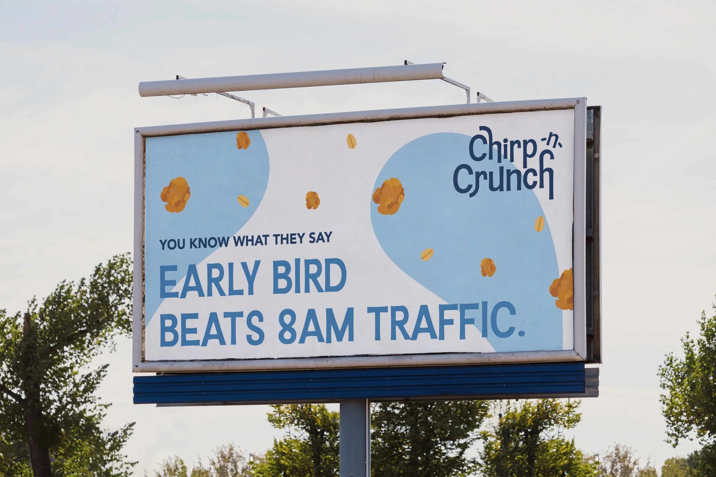
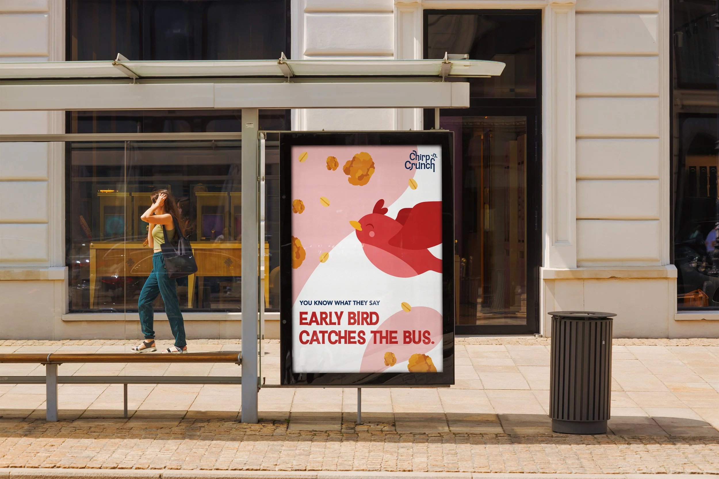
The campaign concept for Chirp-n-Crunch plays on the familiar phrase, “the early bird catches the worm.” Designed for morning eaters, the idea connects seamlessly with the cereal’s bird mascot while offering a relatable message that speaks to productivity, routine, and starting the day strong.

